

KEY TAKEAWAYS
- CRI describes average colour fidelity relative to a reference.
- The familiar Ra value averages eight test samples.
- High Ra does not guarantee strong saturated-red rendering.
- CCT and colour rendition answer different questions.
- Samples and spectral data strengthen colour-critical specifications.
01When ‘High CRI’ Still Looks Wrong
A fabric sample can appear clean under one 90-CRI spotlight and unexpectedly dull under another carrying the same headline value. That is not necessarily a measurement error. The general Colour Rendering Index, usually written as CRI or CIE Ra, averages the colour shifts of eight moderate-chroma test samples under a source compared with a reference of similar correlated colour temperature. It compresses a complex spectrum into one familiar score. The number remains useful for screening products, but it cannot describe every hue, saturation shift or preference response. In commercial lighting, where skin, food, textiles, timber, artwork and brand colours may all be important, a single average should begin the discussion rather than end it.
What Is CRI and Why Does It Matter in Commercial Lighting — Design Essentials
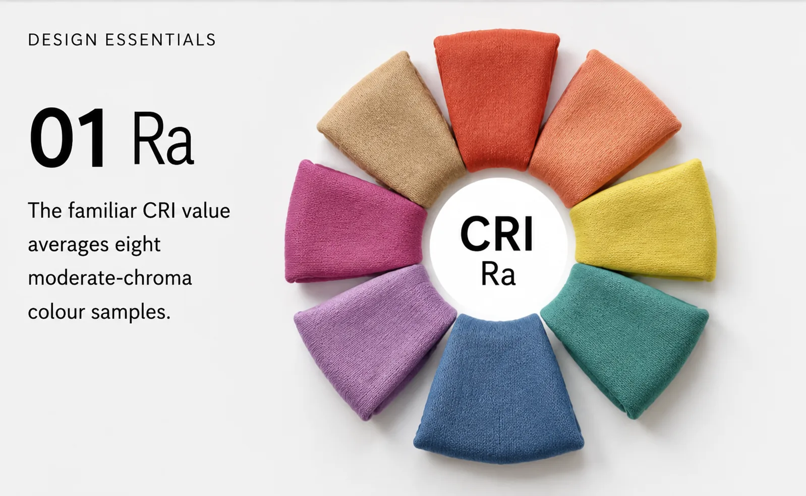
01 Ra
The familiar CRI value averages eight moderate-chroma colour samples.

02 R9
Strong red rendering deserves separate attention in skin, food and fashion.
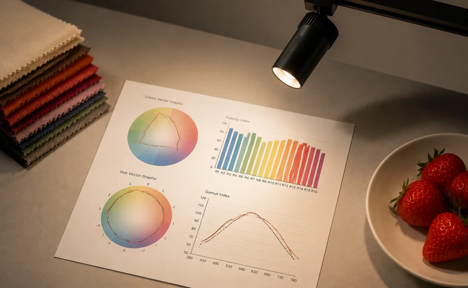
03 TM-30
Fidelity, gamut and hue graphics reveal information hidden by one average.
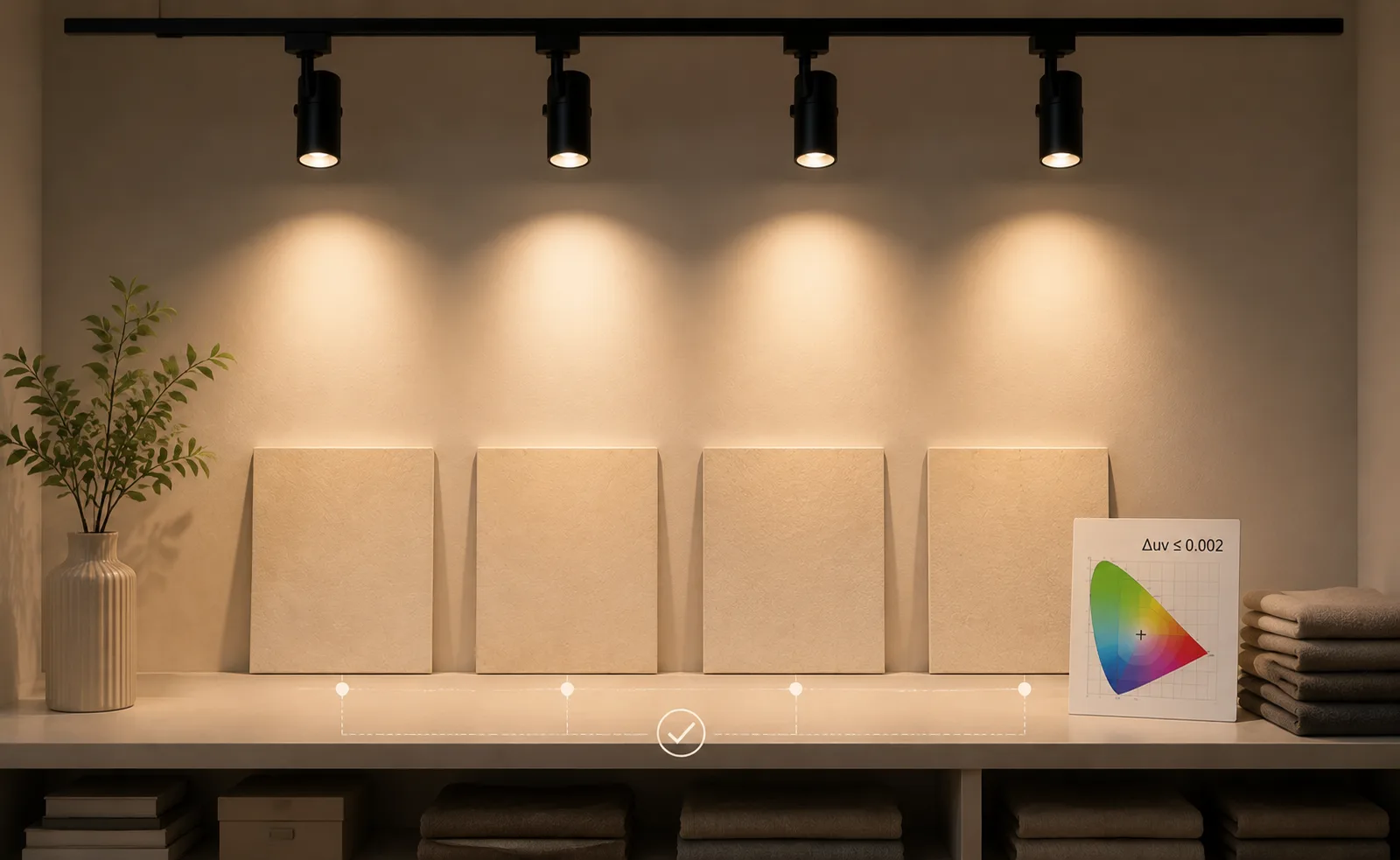
04 Consistency
Chromaticity control keeps adjacent luminaires visually matched.
02How the Reference and Samples Work
CRI is a relative fidelity metric. For lower CCT sources the reference is based on a Planckian radiator; at higher CCTs a daylight reference is used. A score near 100 means the tested samples undergo little average colour shift relative to that reference. It does not mean the spectrum resembles daylight, that every colour is perfect, or that observers will prefer the result. The special indices R1 to R14 report individual sample behaviour. R9, representing strong red, is often requested because saturated reds are absent from the eight-sample Ra average and are important for skin, food and many retail products. A specification should state both the general metric and any critical special index instead of relying on an undefined phrase such as ‘excellent colour’.
Colour Quality Specification Layers
| Metric or check | What it describes | Why it matters |
|---|---|---|
| CRI Ra | Average colour fidelity | Useful first screening value |
| R9 / special indices | Selected saturated colours | Highlights application-specific weakness |
| TM-30 and mock-up | Fidelity, gamut and appearance | Supports nuanced final approval |
03Retail, Hospitality and Workplace Priorities
Colour requirements change with the commercial task. Fashion retail needs reliable differentiation of near-neutral textiles and accurate skin appearance in fitting areas. Food displays may benefit from careful saturation, but excessive enhancement can misrepresent the product. Hospitality interiors must preserve the warmth of timber, stone and upholstery while maintaining comfortable faces. Offices generally prioritise consistency, comfort and acceptable fidelity across large quantities of luminaires. Museum and gallery projects require a conservation strategy as well as colour quality. BEAMX is relevant for focused commercial accents, while SHOWLITE can serve small-scale display tasks where the appearance of objects is closely observed. Each should be selected with the project’s required CCT, CRI, R9 and consistency data.
04Go Beyond Ra Where Colour Is Critical
Modern evaluation methods such as IES TM-30 add a fidelity index, a gamut index and graphical information about hue-specific shifts. These tools help a designer distinguish between two sources that share a similar CRI but render saturation differently. Spectral power distribution data can also reveal gaps or peaks that influence particular materials and camera response. None of these metrics replaces viewing samples. A mock-up should use the actual luminaire, optic, output level, dimming condition and finish samples because optical materials and adaptation affect perception. Colour consistency across batches matters too; a high rendering score cannot compensate for visible chromatic differences between adjacent fittings. For retail rollouts, binning, replacement strategy and supplier control deserve explicit documentation.
05Write a Performance-Based Colour Specification
Start by identifying the colours and materials that carry business or design risk. Set a minimum Ra, include R9 or TM-30 criteria where appropriate, define CCT and chromaticity tolerance separately, and request data at the intended operating condition. Confirm whether dimming changes colour and whether replacement modules remain matched over time. In Dior Shanghai, accurate reading of merchandise and finishes supports trust as much as visual richness; accent lighting should reveal the palette without exaggerating it. The final judgement is therefore a chain: dependable metrics, consistent production, representative samples and an approved mock-up. When those elements agree, colour quality becomes part of the architecture rather than a catalogue claim competing for attention. Procurement review should also ask how colour data is maintained across the product range. A manufacturer may offer several wattages or beam angles with different LED packages, and the published rendering information may not apply identically to every variant. Request test data for the exact CCT and module being ordered, then agree an acceptable production tolerance. If the project will expand in phases, reserve replacement stock or establish a future matching procedure. Dimming trials should include the lowest normal scene, where differences between sources can become more apparent against dark surroundings. For international rollouts, do not assume that a single CRI threshold will satisfy every brand material or local expectation. A concise colour-quality schedule, supported by approved samples, is more dependable than a broad statement copied across all luminaire types.