

KEY TAKEAWAYS
- CCT describes colour appearance, not colour-rendering quality.
- Lower kelvin values appear warmer; higher values appear cooler.
- Materials and daylight influence how a CCT is perceived.
- One project may need a controlled family of temperatures.
- Consistency and dimming behaviour must be specified.
01The Same 3000K Can Belong to Different Rooms
Place a 3000K source against dark walnut and brushed brass and it may feel intimate; use it beside cool grey stone under strong daylight and it can read noticeably warm. Correlated colour temperature, or CCT, describes the appearance of white light by relating its chromaticity to the colour of a heated reference radiator. It is expressed in kelvins. Lower values such as 2700K look warmer, while 4000K and above appear cooler. CCT is not a temperature of the luminaire, nor is it a measure of colour fidelity. It locates a source along one broad warm-to-cool dimension. Architectural selection must still consider tint, spectrum, surface colour, brightness and adaptation.
Understanding CCT: How to Choose the Right Color Temperature — Design Essentials
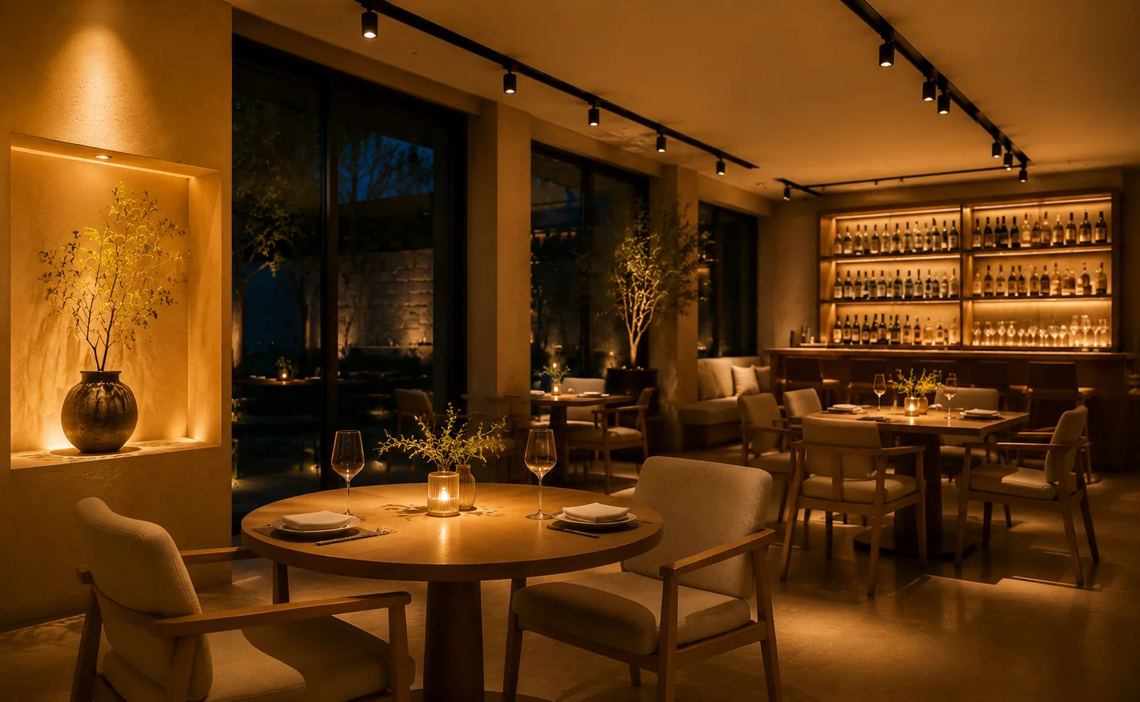
01 2700K
An intimate warm appearance often suited to evening hospitality.

02 3000K
A versatile warm-neutral reference for refined commercial interiors.

03 3500K
A balanced transition between warm materiality and workplace clarity.
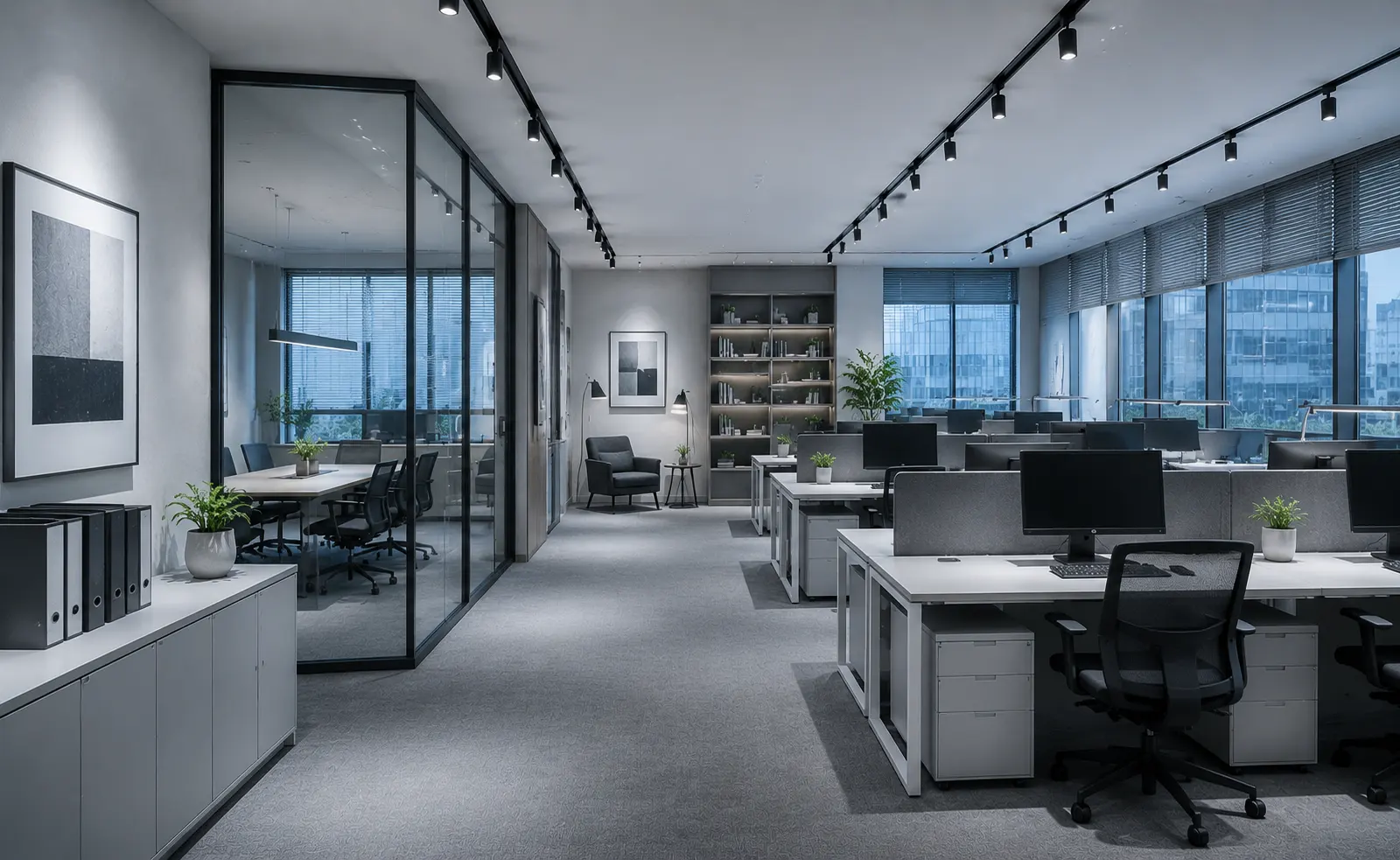
04 4000K
A cooler, crisp appearance for selected office and technical settings.
02Choose a Range from the Project Narrative
Hospitality spaces often begin around 2700K or 3000K because warm light supports evening adaptation and complements timber, textiles and skin. Retail may use 3000K for luxury warmth, 3500K as a balanced neutral, or 4000K for a crisp technical identity. Offices commonly adopt 3500K or 4000K, subject to regional practice and the desired relationship with daylight. These are starting points rather than rules. A bakery, jewellery boutique, clinic and collaborative workplace ask for different atmosphere and material response even when their illuminance is similar. The chosen CCT should reinforce the intended reading of the space without making white surfaces look unintentionally yellow, blue or disconnected from adjacent zones.
CCT Starting Points
| Application mood | Common starting range | Design check |
|---|---|---|
| Intimate hospitality | 2700K–3000K | Review skin and warm materials |
| Balanced retail / mixed use | 3000K–3500K | Compare with daylight and brand palette |
| Crisp workplace / technical | 3500K–4000K | Control tint and adjacent-zone transitions |
03Coordinate Daylight, Brightness and Time
CCT is perceived in context. A warm source can look overly amber beside a cool daylight façade during the afternoon, yet comfortable after sunset. Higher illuminance levels are often accepted with a cooler appearance, while dim evening scenes frequently feel coherent at warmer settings. Tunable-white systems can respond across the day, but they introduce control, commissioning and colour-consistency requirements. In fixed-CCT schemes, transitional spaces deserve attention: a corridor at 3000K leading into a 4000K workplace may make the shift visible at every doorway. Designers should map daylight exposure and operating hours, then decide where continuity is important and where a deliberate change in atmosphere helps orientation or programme.
04Keep Colour Appearance Consistent
Nominal CCT alone does not guarantee a match. Sources with the same kelvin label can sit above or below the Planckian locus and appear greener or pinker. Chromaticity tolerance, often communicated through SDCM or MacAdam ellipse steps, should be specified for adjacent luminaires and replacement stock. Dimming behaviour also matters: standard LEDs generally maintain their nominal colour, while dim-to-warm products intentionally shift toward lower CCT as output falls. SILO can support refined hospitality downlighting, EMMA can serve application-led ambient schemes, and SOFT is relevant where warm, low-glare ceiling integration is desired. The exact LED option and control gear must be coordinated across the selected families.
05Approve CCT on Real Materials
Samples viewed on a desk are helpful but incomplete. Build a mock-up at the intended illuminance, mounting position and dimming level, then place the actual paint, stone, timber, fabrics and metallic finishes in the scene. Check the result in daylight and after dark. Photographing can reveal camera-related shifts, but visual approval should remain primary unless broadcast or content creation is a project requirement. For a hospitality project, guestrooms, corridors, reception and dining areas may share a warm family while using subtly different scene levels and optical distributions. A successful CCT strategy feels inevitable: it supports materials, faces and time of day without visitors consciously noticing a sequence of competing white tones. The final schedule should distinguish nominal CCT from the acceptable chromaticity range. This prevents one supplier from interpreting 3000K broadly while another provides a much tighter match. Identify which luminaires are seen together, because tolerance is most critical within a continuous ceiling or on one uninterrupted wall. Sources in separate rooms may allow more variation, provided the transition is intentional. If decorative pendants, joinery lights and architectural downlights come from different suppliers, assemble them in the same mock-up; individually acceptable whites can conflict when viewed together. Maintenance information should record CCT, binning or tolerance, driver and dimming type. A coherent white-light palette is not secured at concept stage alone—it depends on controlling the chain from sample approval to replacement stock.